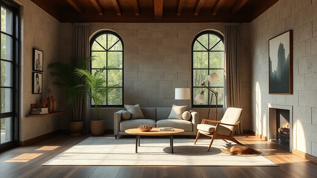
Natural Textures and the Psychology of a Balanced Room

A single piece of raw walnut sits on a workbench, its grain swirling like a topographical map. Next to it, a pile of smooth river stones and a swatch of heavy, unbleached linen. These aren't just "decor items." They are tactile tools used to manipulate how a human being feels inside a room. This post explores how natural textures influence human psychology, how to balance hard and soft surfaces, and the mathematical approach to avoiding a room that feels either too sterile or too cluttered.
We often talk about color palettes, but we ignore the sensory weight of the materials themselves. A room filled with smooth, polished surfaces—think glass coffee tables and high-gloss lacquer—can feel visually striking but emotionally cold. Conversely, a room with too much texture can feel chaotic and overstimulating. Finding the center point is where the design magic happens.
Why Do Natural Textures Make a Room Feel Calmer?
Natural textures reduce psychological stress by satisfying our innate biological preference for organic shapes and irregularities. In the world of environmental psychology, this is often linked to biophilia—the idea that humans possess an innate tendency to seek connections with nature and other forms of life. When you introduce materials like unfinished wood, stone, or wool, you are effectively lowering the "visual noise" of a space.
Think about the difference between a flat, printed wallpaper and a real grasscloth. The grasscloth has depth; it catches light in a way that is unpredictable and soft. This unpredictability is actually soothing to the brain. A perfectly smooth, synthetic surface can feel "uncanny" or sterile because it lacks the micro-variations found in the real world.
If you want to see the science behind how our environments impact our well-being, the Wikipedia entry on Biophilia provides a deep dive into the research. It isn't just "vibes"—it's biology. When your eyes land on a textured linen pillow instead of a shiny polyester one, your nervous system receives a signal that the environment is "real" and stable.
The Texture Hierarchy: Hard, Soft, and Tactile
To build a balanced room, you have to categorize your materials by their structural properties. I like to think of this as a construction stack. You start with the "bones" and layer outward.
- The Foundation (Hard/Structural): These are your non-negotiables. Think hardwood floors, stone countertops, or a heavy oak dining table. They provide the visual and physical gravity of the room.
- The Intermediate Layer (Textural/Organic): This is where you add the "soul." A jute rug, a rattan lounge chair, or a linen-wrapped headboard. These items bridge the gap between the rigid structure and the comfort of the inhabitant.
- The Soft Layer (Tactile/Comfort): These are the items that invite touch. Velvet throw pillows, a chunky knit wool blanket, or heavy cotton drapery.
If you've ever felt like a room was "missing something" despite having plenty of furniture, you likely missed a layer in this hierarchy. You might have the structure and the softness, but you lack the organic middle ground. It's the difference between a room that looks like a showroom and a room that feels like a home.
How Do You Balance Hard and Soft Surfaces?
Balance is achieved by ensuring that no single texture dominates more than 60% of the visual field. If you have a room full of hard, angular surfaces—like a concrete floor, a glass desk, and metal shelving—the space will feel aggressive and "sharp." To fix this, you must introduce a counter-weight of softness.
I often see people try to fix a "cold" room by adding more color. That's a mistake. A bright red pillow on a cold metal chair doesn't make it warmer; it just makes it a bright, cold chair. Instead, you need to change the physical property of the surface. Instead of a red pillow, use a deep terracotta linen pillow. The texture provides the warmth that the color alone cannot achieve.
A good way to check your work is to look at your room through a "black and white" lens. If you were to take a photo of your room in grayscale, would the textures still be distinguishable? If everything looks like the same shade of gray, your room lacks depth. You need to ensure a mix of matte, satin, and rough finishes.
| Material Type | Visual Weight | Psychological Effect | Best Pairing |
|---|---|---|---|
| Polished Marble | Heavy/Cold | Luxury, Sophistication | Warm Wood or Wool |
| Jute/Sisal | Medium/Rough | Grounding, Earthy | Linen or Cotton |
| Velvet | Light/Soft | Comfort, Elegance | Metal or Glass |
| Brushed Brass | Light/Reflective | Warmth, Sparkle | Matte Ceramics |
One thing to keep in mind: texture is not just about what you touch, but what your eyes "feel." A matte-finish paint (like the Benjamin Moore matte collections) actually absorbs light, making a wall feel more substantial and "soft" than a high-gloss finish that bounces light aggressively around the room.
Can Too Much Texture Make a Room Feel Small?
Yes, excessive or poorly scaled texture can make a space feel claustrophobic and visually cluttered. This happens when you use "busy" textures—like heavy, dark floral patterns or highly intricate carvings—on large-scale items in a small room. It creates a sense of visual weight that can literally make the walls feel like they are closing in.
The trick is to scale your textures. In a small room, use large-scale, subtle textures. A large, plain woven wool rug is much better than a small, busy Persian rug. The larger pattern provides a sense of continuity and expands the floor area, whereas small, high-contrast patterns break the floor into "chunks," making it feel smaller.
If you're working with a tight space, don't be afraid of smooth surfaces, but don't let them be the only thing there. A single, well-placed wooden stool or a stone vase can provide the necessary organic touch without overwhelming the room's dimensions. It's about intentionality, not volume. If you're struggling with the proportions of your furniture, you might want to check out my post on the 60-30-10 rule to ensure your color and texture ratios are mathematically sound.
The "Touch Test" for Design Confidence
When you're out sourcing materials—whether you're at a local nursery or a high-end furniture boutique—don't just look. Touch. A designer's greatest tool isn't their eyes; it's their hands. If a material feels "cheap" or "plastic-y" to your touch, it will likely feel that way in your home, regardless of how much you spend.
I've spent years rescuing furniture that felt "dead" because the finish was too uniform. A piece of wood that has been sanded down to a perfectly smooth, unnaturally even finish loses its character. When you're building or refinishing something, leave some of the "soul" in. A slight irregularity in a hand-planed edge or the visible grain in a piece of reclaimed timber adds a level of structural honesty that a factory-perfect item simply can't match.
For those of you working on your own builds, remember that the material dictates the finish. You wouldn't use a heavy, industrial-grade sandpaper on a soft pine wood and expect a graceful result. Understanding the relationship between your tool and your material is the first step to moving from a "DIYer" to a designer. If you want to get serious about your material choices, read my guide on decoding common materials for lasting builds.
Texture is the silent language of a room. It tells your brain whether it's time to be alert and productive or time to rest and recover. By intentionally layering your hard, soft, and organic elements, you aren't just decorating—you're engineering an atmosphere.