The 60-30-10 Rule Is Not Decor Advice—It’s Structural Design Math (And Why Your Room Feels Off)

Listen, if your room feels "off" and you can’t explain why, it’s not because you need another throw pillow. It’s because your ratios are lying to you.
I spent years drawing glass towers where a 2% proportion error could ruin an entire facade. That same principle? It shows up in your living room. The difference is no one taught you how to see it.
We’re going to fix that. This is the actual Design Math behind the 60-30-10 rule—not the watered-down version you’ve seen recycled into "decor tips." This is how you build a room that feels intentional, not accidental.
Let’s get into the sawdust.
The Design Math (Why 60-30-10 Exists)
The 60-30-10 rule isn’t about color palettes—it’s about visual weight distribution.
In architecture, we balance mass and void. In interiors, we balance dominant, secondary, and accent elements. If you stack too much visual weight in one category, your brain reads it as chaos.
- 60% = The dominant field (walls, large furniture, flooring)
- 30% = The structural support (secondary furniture, textiles)
- 10% = The tension (contrast, hardware, accents)
That last 10%? That’s where most people panic and overcompensate. (Yes, I’m looking at your six mismatched throw pillows.)
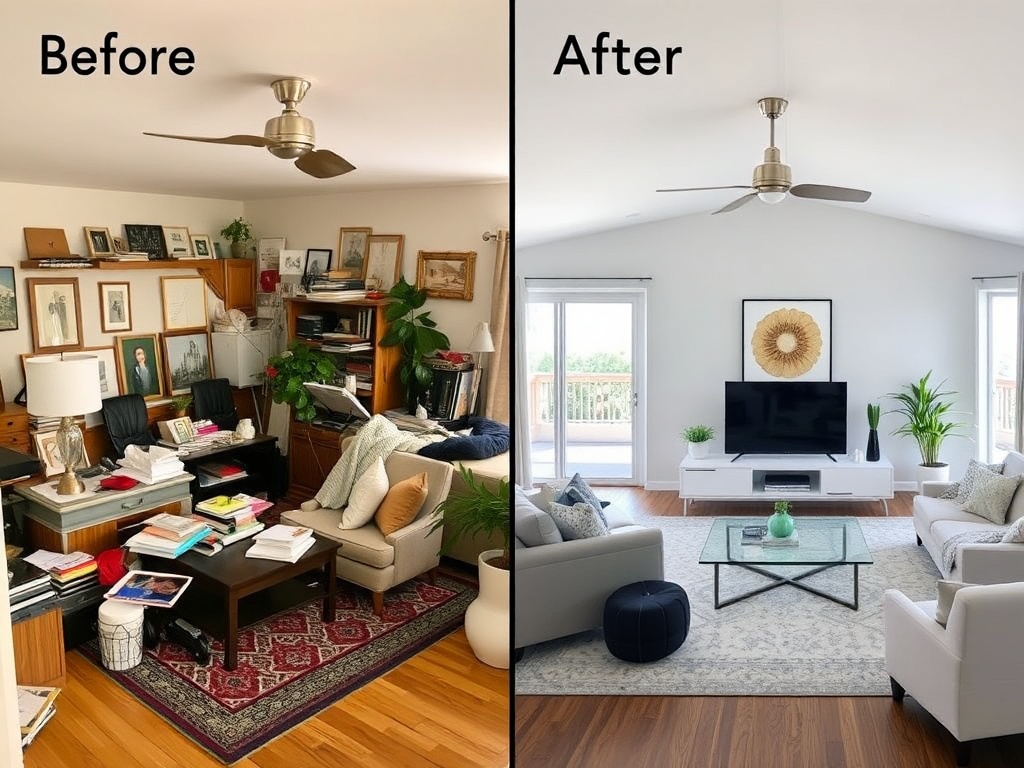
Where Most Rooms Go Wrong (The Post-Mortem)
Here’s the brutal honesty section.
Most "landlord special" rooms fail because everything is fighting for attention at the same volume. You’ve got:
- A loud rug
- A loud couch
- Loud wall art
- And zero hierarchy
That’s not personality. That’s noise.
(I’ve done it. I once layered three patterned textiles and spent two weeks wondering why I felt stressed in my own living room.)
The fix is not removing personality—it’s assigning roles.
Breaking It Down Room by Room
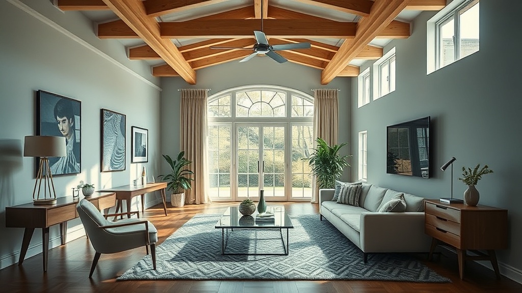
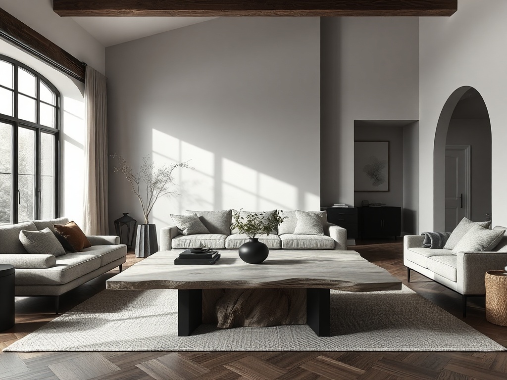
Living Room
Your 60% is usually your walls + sofa + floor. Keep this grounded. Neutral doesn’t mean boring—it means stable.
Your 30% is your chairs, rug, and curtains. This is where texture comes in. Think linen, wool, wood grain.
Your 10% is hardware, lighting, and small objects. Matte black hardware alone can fix half your problems.
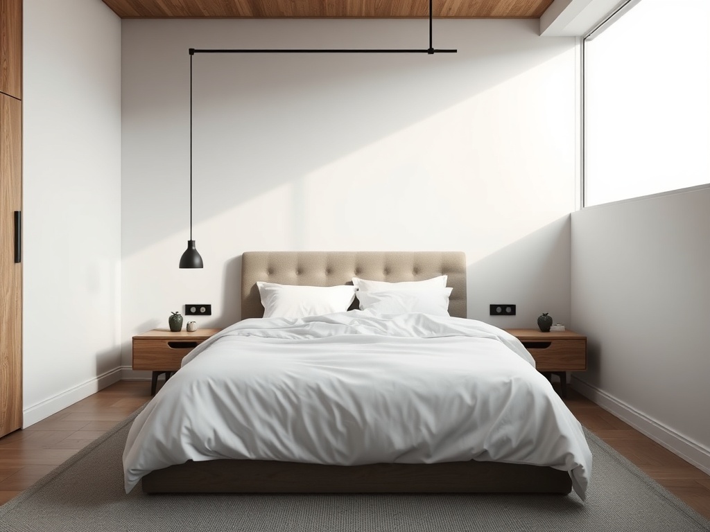
Bedroom
The bed is your 60%. Treat it like architecture, not decoration.
The 30% becomes side tables, lighting, and textiles.
The 10%? That’s restraint. One strong accent beats five weak ones.
Kitchen
Cabinetry and walls dominate your 60%.
Backsplash, stools, and open shelving live in the 30%.
Hardware and fixtures are your 10%. This is where matte black earns its reputation.
Pro-ish Tips (That Actually Work)
- Count Objects: If your accent category exceeds 10% visually, remove something.
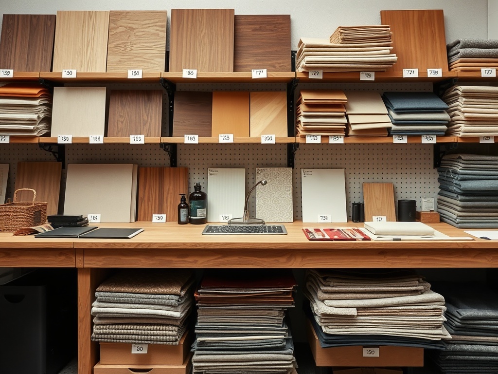
- Match Undertones: Warm oak + cool gray = tension you didn’t ask for.
- Limit Finishes: Two wood tones max. Three is chaos.
- Anchor First: Fix your 60% before touching accessories.
The Cost Ledger (Because Design Isn’t Free)
| Item | Cost |
|---|---|
| Neutral rug (anchor) | $68 |
| Linen curtains | $34 |
| Matte black hardware swap | $22 |
| Accent lighting | $18 |
| Wood conditioner + stain (test samples) | $9.50 |
| Total True Cost | $151.50 |
Could you spend more? Obviously. But this is a structural upgrade, not a shopping spree.
Mistakes I Made (So You Don’t Repeat Them)
- I overloaded the 10% category because it was "fun" (it wasn’t—it was visual clutter).
- I ignored undertones and ended up with a room that felt cold and muddy at the same time.
- I tried to fix a bad 60% with accessories. That never works.
The biggest lesson? You can’t decorate your way out of bad structure.
Final Check: Audit Your Room Like an Architect
Stand in your room and ask:
- What is the dominant 60%?
- Does the 30% support it—or compete with it?
- Is the 10% intentional or chaotic?
If you can’t answer those, that’s your starting point.
Design isn’t about buying more. It’s about seeing clearly.
And once you see it, you can’t unsee it.