How to Style a Bedside Table for a Relaxed Bedroom

Most people assume that styling a bedside table is about adding more "stuff" to fill the surface area. They treat the nightstand like a junk drawer that happens to be upright, piling up charging cables, half-empty water glasses, and stacks of unread books. This approach fails because it ignores the fundamental architectural purpose of a bedside table: it is a functional zone designed to support your transition from wakefulness to sleep. A well-styled bedside table should balance utility with visual calm, using specific ratios and structural layers to create a sense of order rather than clutter.
This guide provides a technical framework for styling your bedside table to achieve a relaxed, intentional aesthetic. We will move beyond vague suggestions like "add a candle" and instead focus on the math of scale, the physics of lighting, and the structural grouping of objects. Whether you are working with a vintage mid-century modern pedestal or a heavy oak nightstand, these principles will help you design a surface that feels curated rather than accidental.
The Rule of Three and Visual Weight
In design, the "Rule of Three" is a reliable way to prevent a surface from looking stagnant. When you group objects in odd numbers, the human eye perceives more movement and interest. However, for a bedside table, you must also consider visual weight—the perceived heaviness of an object based on its color, texture, and mass.
To create a balanced composition, aim for a grouping that includes three distinct types of objects:
- The Anchor: This is your largest, heaviest item. It provides the structural base for the rest of the arrangement. This could be a substantial ceramic lamp, a large sculptural vase, or a thick stack of hardcover books.
- The Vertical Element: This adds height and draws the eye upward. A slender candlestick, a single tall branch in a bud vase, or a tall glass of water provides the necessary verticality to break up the horizontal plane of the table.
- The Accent: This is a smaller, detailed item that adds texture or color. Think of a small brass tray, a textured stone coaster, or a small wooden bowl for jewelry.
When placing these items, avoid placing them in a straight line. Instead, use a triangular arrangement. If your lamp (the anchor) is on the left, place your books (the vertical element) in the center, and your small tray (the accent) on the right. This creates a dynamic, asymmetrical balance that feels more organic and less rigid.
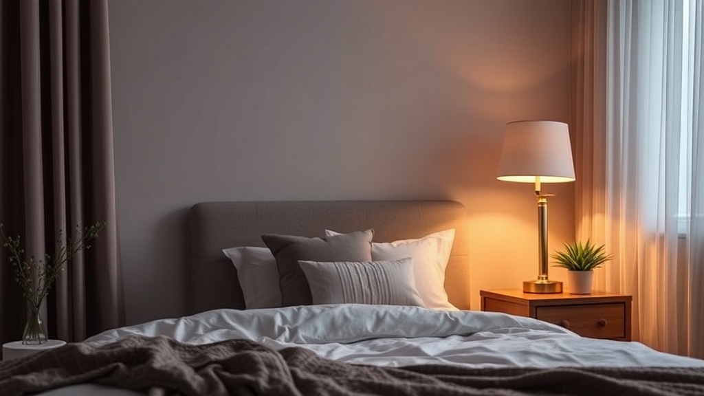
Managing Light and Lumens
The most critical functional element of a bedside table is the light source. In a bedroom, you are not looking for task lighting for reading a blueprint; you are looking for ambient lighting that signals to your circadian rhythm that it is time to wind down. This means you must pay attention to color temperature and lumens.
Avoid using standard "Daylight" bulbs (5000K), which emit a blue light that suppresses melatonin production. Instead, opt for "Warm White" bulbs (2700K) or even "Soft White" (2200K). A lamp with a fabric shade, such as a linen drum shade, will diffuse the light more softly than a glass shade, preventing harsh glares that can disrupt sleep.
If your nightstand is small and lacks space for a traditional lamp base, consider a wall-mounted sconce. This frees up the tabletop surface for your essential items. If you are working with a budget, you can swap your old cabinet hardware on a small chest of drawers to give it a more sophisticated, high-end look that complements a new lighting setup.
The Functionality of Surface Management
A bedside table is a high-traffic zone for personal items. If you do not have a system for managing these, your "styled" surface will be buried under clutter within 48 hours. To maintain a relaxed aesthetic, you must design for the "hidden" and the "displayed."
The Tray Method: One of the most effective ways to manage small items like lip balm, hand cream, or a reading glass is to use a tray. A tray acts as a visual container. By grouping these small items on a tray—perhaps a marble or a dark walnut tray—you turn "clutter" into a "collection." It creates a defined boundary for the mess.
Cable Management: Nothing ruins a curated design faster than a white plastic charging cable snaking across a wooden surface. To solve this, use a weighted cable holder or a decorative box. If you have a drawer in your nightstand, use it to house your power strip and long cords, leaving only the very tip of the cable visible on the surface. This keeps the visual field clean and reduces cognitive load before bed.
Texture and Materiality
To achieve a "relaxed" look, you must move away from high-gloss, synthetic surfaces and toward materials that have tactile depth. A bedroom should feel grounded. This is achieved through a mix of hard and soft textures.
Consider the following combinations to add professional-grade depth to your bedside arrangement:
- Wood and Stone: A wooden nightstand paired with a marble coaster or a heavy stone candle holder creates a sense of permanence and weight.
- Metal and Glass: A brass lamp paired with a clear glass carafe adds a touch of elegance without feeling heavy or overbearing.
- Ceramic and Linen: A matte ceramic vase paired with a linen-wrapped book or a small linen textile adds a soft, organic element that invites touch.
When selecting these items, avoid "matching sets." If your lamp, tray, and bowl all come from the same mass-produced collection, the table will look sterile. Instead, look for pieces with varying finishes—matte, polished, brushed, and textured—to create a layered, lived-in feel.
Scale and Proportions: The Math of the Nightstand
A common mistake is choosing a bedside table that is either too small for the bed or too large for the room. From an architectural standpoint, the height of the table should be roughly level with the top of your mattress. If the table is significantly lower, reaching for a glass of water becomes an awkward physical movement; if it is too high, it creates a visual obstruction.
Once the piece is in place, use the 60-30-10 rule for your surface styling to ensure you don't over-decorate:
- 60% Functional Space: This is the empty or "breathing" space on the table. It ensures the surface doesn't feel cramped and allows room for your actual needs (a lamp, a phone, a glass of water).
- 30% Primary Decor: This is your anchor object, such as a lamp or a large stack of books.
- 10% Accent Decor: This is the small, decorative detail, like a single candle or a small sculptural piece.
If you find that your nightstand feels "empty" but adding objects makes it feel "cluttered," you likely have a scale issue. A single, large, high-quality object often looks better than five small, cheap objects. If you have a large surface area, instead of adding more small items, increase the scale of your primary object—for example, swap a small bud vase for a larger floor-style vase.
A Final Checklist for a Relaxed Surface
Before you consider your styling complete, perform a "visual sweep." Stand at the foot of your bed and look at the nightstand from a distance. Does the eye jump erratically between many small points, or does it follow a smooth path? A successful design guides the eye through a controlled movement.
The "One-In, One-Out" Rule: To maintain this relaxed state, adopt the habit of the one-in, one-out rule. If you bring a new book or a new decorative object to the bedside, an old one must be moved to a drawer or another room. This prevents the slow creep of "functional clutter" that eventually destroys the intentionality of your design.
By treating your bedside table as a structured design project rather than a storage solution, you create a space that supports your rest. Use the principles of scale, light temperature, and material depth to build a surface that is as functional as it is beautiful.