7 Ways to Style Your Coffee Table Like a Pro

Start with a Foundation of Coffee Table Books
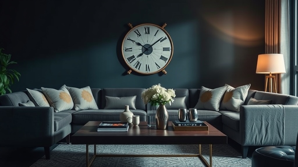
Add Height with a Statement Vase
Use a Tray to Group Small Objects
Introduce Natural Elements and Greenery
Incorporate Different Textures
Add a Scented Candle for Ambience
Leave Some Negative Space
You walk into your living room, sit on the sofa, and realize the center of the room feels hollow. Your coffee table is either a cluttered landing strip for remote controls and half-empty water glasses, or it is a barren slab of wood that lacks any visual interest. A well-styled coffee table serves as the anchor for your seating arrangement, providing a sense of scale and texture that pulls the entire room together. This guide breaks down seven specific, structural methods to style your table using design math, varying heights, and intentional layering.
1. Use the Rule of Three for Visual Balance
In design, odd numbers are more visually stimulating than even numbers because they create a sense of movement rather than a static, symmetrical line. When arranging objects on a coffee table, group items in sets of three or five. This prevents the surface from looking like a formal, stiff museum display and instead makes it look curated.
To execute this, choose three objects of significantly different heights. For example, place a tall, slender vase next to a medium-sized sculptural bowl, and finish with a low, flat object like a stack of hardback books. This creates a "triangular" silhouette when viewed from the side. If you use two objects, the eye perceives a gap; if you use four, the eye sees a line. Three objects force the eye to move in a way that feels organic.
2. Vary Height and Scale
The most common mistake in coffee table styling is "flatness"—placing several items of the same height next to one another. This makes the table look one-dimensional. To fix this, you must think about verticality. You need a "hero" object that draws the eye upward, a secondary object for mid-level interest, and a base layer for stability.
A high-quality way to achieve this is by using books as architectural pedestals. Instead of just laying a book flat, stack two or three large-format coffee table books—such as a thick Taschen art book or a heavy monograph on architecture—to create a platform. On top of this "pedestal," place a small candle or a brass object. This adds height without requiring a massive, bulky item that might overwhelm the table's actual footprint. This technique is essential if you have a large, expansive table that feels empty despite having several items on it.
3. Layer Textures to Add Depth
A coffee table shouldn't just be a collection of hard surfaces. If you have a marble-top table or a heavy oak table, adding soft textures will prevent the room from feeling cold or industrial. Texture adds a tactile quality that makes a living space feel lived-in rather than just "decorated."
Consider adding a small wooden tray to group smaller items. The tray acts as a "frame" for your objects, providing a structural boundary. If your table is a hard surface like glass or metal, introduce a textile element. While you wouldn't put a rug on a coffee table, you can use a linen napkin draped near a bowl or a small woven basket to hold coasters. If you are looking to soften the edges of your entire seating area, you might also consider ways to use indoor plants to soften your living room, as a small potted plant on the table serves as a living texture that bridges the gap between furniture and decor.
4. Incorporate Organic Elements
Even the most modern, minimalist room needs something organic to feel human. Plants, stones, or wood elements break up the straight lines and right angles of standard furniture. A coffee table with only geometric shapes can feel clinical; a piece of nature adds much-needed "imperfection."
For a low-maintenance option, use a shallow ceramic bowl filled with smooth river stones or even a sculptural piece of driftwood. If you prefer greenery, a small vessel with a single branch of eucalyptus or a monstera leaf provides height and a pop of color without the clutter of a full floral arrangement. Unlike a large bouquet, a single architectural branch looks intentional and sophisticated. Just ensure the vessel is heavy enough to prevent tipping if someone bumps the table.
5. Create Functional Zones with Trays
A coffee table is a functional piece of furniture, not just a display stand. It holds your coffee, your current read, and perhaps your glasses. Without a system, these items become "clutter." A tray is the designer's secret weapon for turning functional items into a styled vignette.
Select a tray that is roughly one-third to one-half the width of the table. A heavy marble tray or a textured wooden tray can act as a "home" for your most-used items. Place your candle, a small dish for coasters, and a remote control inside the tray. By containing these items within a boundary, you signal to the eye that they are part of the design rather than just random objects left out. This keeps the surface looking organized even when the table is in active use.
ul>6. Play with Material Contrast
To make a coffee table look professional, you need to mix your materials. If every item on the table is made of the same material—for example, all white ceramic—the arrangement will lack "punch." You want to create a conversation between different finishes: matte vs. shiny, rough vs. smooth, metal vs. organic.
A winning formula is the "Metal, Glass, and Wood" trio. Try placing a polished brass candle snuffer (shiny/metal) next to a matte ceramic vase (matte/smooth) on top of a stack of linen-bound books (textured/fabric). This contrast creates visual tension, which is what makes a designer'ery look "expensive." If you have a glass coffee table, avoid too many glass objects, as they will disappear. Instead, use heavy, opaque objects like stone or dark wood to provide a visual anchor against the transparency of the glass.
7. Use Negative Space Strategically
The biggest mistake beginners make is trying to fill every square inch of the table. This is known as "over-styling," and it makes a room feel cramped and stressful. In architecture, we rely heavily on negative space—the empty areas around a structure—to define the shape of the object. Your coffee table needs the same thing.
Leave at least 40% of the table surface empty. This "breathing room" allows the eye to rest and makes the items you have chosen to display look more important. If you have a large rectangular table, don't spread items across the entire length. Instead, create one or two concentrated "clusters" of decor. This creates a focal point and prevents the table from looking like a cluttered workbench. If you find yourself constantly adding more "stuff" to fill the gaps, stop and remove one item. If the arrangement still feels complete, you have achieved the perfect balance of density and space.
Summary Checklist for Your Next Styling Session:
- The Rule of Three: Are my items grouped in odd numbers?
- Height Variation: Do I have a tall, medium, and low object?
- Texture Mix: Have I included something soft, something hard, and something organic?
- The Tray Test: Are my functional items contained within a tray or a designated zone?
- Negative Space: Is there enough empty space to let the design breathe?