How to Create a Moody Maximalist Gallery Wall

There is a common misconception in the design world that "maximalism" is just a polite word for "clutter." People see a wall covered in frames and think it’s a lack of discipline. But after years of drafting rigid, minimalist floor plans for high-rise developments, I’ve learned that true maximalism isn't about chaos—it’s about intentional density. It is the art of curated excess.
When we talk about a Moody Maximalist Gallery Wall, we aren't just hanging pictures. We are constructing a visual narrative. We are using depth, shadow, and texture to turn a flat, lifeless wall into a structural focal point. If you want to move beyond the basic grid of a Pinterest-friendly gallery and move into something that feels soulful and architecturally grounded, you need to stop thinking like a decorator and start thinking like a curator.
The Foundation: Selecting Your Color Story
A moody gallery wall lives or dies by its color palette. In my architecture days, we used "accent walls" to create zones. In a moody maximalist space, the wall itself becomes the canvas. To achieve that deep, enveloping feeling, you have to move away from "eggshell" or "off-white."
You want colors with high pigment density and low light reflectance. Think of these as your structural base. Consider the following palettes:
- The Midnight Library: Deep navy, charcoal, and forest green. This works beautifully with gold or brass frames to add a sense of "old world" luxury.
- The Earthy Alchemist: Terracotta, burnt umber, and ochre. This is perfect if you want a warmer, more organic maximalism that feels grounded rather than heavy.
- The Noir Minimalist: A monochromatic black-on-black approach. Using matte black paint on the wall with varying textures of black frames creates a sophisticated, sculptural effect.
Pro Tip: When choosing your paint, always test a large swatch near your furniture. In a moody room, the light will shift dramatically throughout the day. A color that looks like a deep teal at noon might look like a black hole by 7:00 PM. Aim for a color that retains its character in low light.
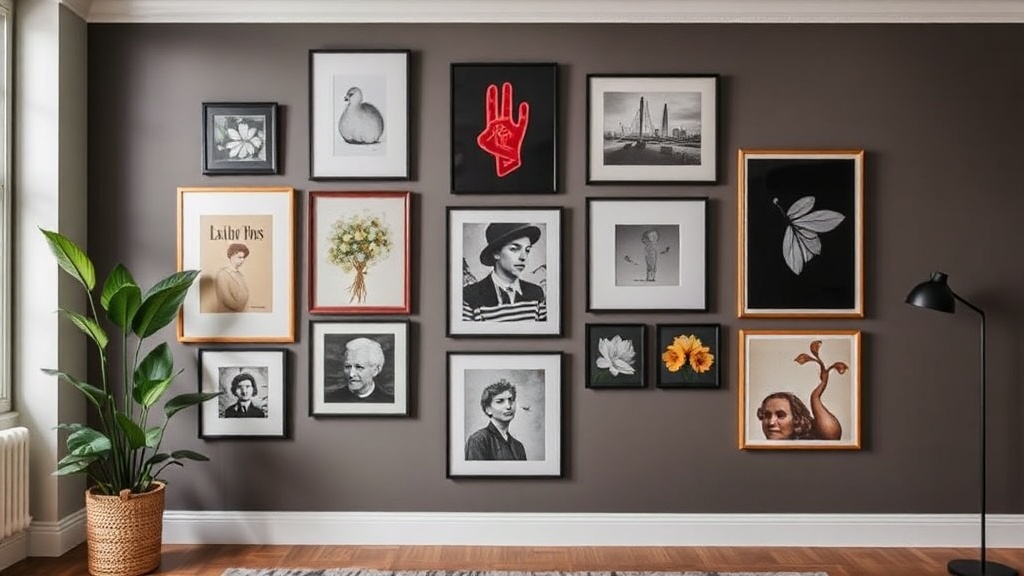
The Anatomy of the Collection: Variety vs. Cohesion
The biggest mistake DIYers make is choosing pieces that are too similar. If every frame is a 5x7 landscape of a mountain, you don't have a gallery; you have a repetitive pattern. A true maximalist wall requires tension. You need a mix of mediums, scales, and subjects to keep the eye moving.
1. Vary the Mediums
Don't just stick to framed paper. To add the "architectural grit" I love, integrate three-dimensional objects. This breaks the two-dimensional plane of the wall and creates actual shadows. Incorporate:
- Textile Art: A small woven tapestry or a framed piece of vintage silk.
- Sculptural Elements: A brass wall sconce, a carved wooden mask, or even an antique clock.
- Botanicals: Pressed ferns or even a small, wall-mounted ceramic vase.
2. Play with Scale and Proportion
In design math, we often talk about the "anchor" piece. Every gallery wall needs one large, heavy-hitting element—something that acts as the visual weight. This might be a large oil painting or a substantial mirror. Once your anchor is placed, you build outward using smaller pieces to create a sense of "controlled spillover."
3. The Frame Mix
If you want the wall to feel cohesive, you can use a consistent frame color (like all black or all gold), but vary the profiles. Mix a thin, modern metal frame with a heavy, ornate baroque frame. The contrast in texture creates the "maximalist" energy without looking like you just threw everything at the wall.
The Technical Execution: The "Floor First" Method
I’ve seen too many people drive a nail into a wall, realize it’s crooked, and end up with a dozen holes in their drywall. As someone who spent years obsessing over precise measurements, I am telling you: do not start on the wall.
- Lay it out on the floor: Clear a large space on your floor that matches the dimensions of your wall. This is your "staging area."
- The Template Trick: Take your frames and trace them onto brown butcher paper or old newspapers. Tape these paper templates to the wall using painter's tape. This allows you to visualize the spacing and the "flow" without damaging your paint.
- Check the Sightlines: Stand back. Walk around the room. Does the arrangement feel heavy on one side? Is there a "dead zone" where the eye gets stuck? Adjust your paper templates until the weight feels balanced.
- Account for Depth: Remember that a 3D object (like a sconce) takes up more physical space than a flat frame. Make sure your paper templates reflect the widest part of your objects.
"Design is not just about how things look, but how they occupy space. A gallery wall is a structural installation, not a collection of decorations."
The Lighting: Creating the Drama
A moody gallery wall is useless if it’s sitting in a dark corner with no illumination. To truly bring out the textures of your frames and the depth of your paint, you need layered lighting. This is where the "maximalism" truly comes alive through shadow play.
Directional Lighting: Use picture lights (the kind that clip or attach to the top of a frame) to highlight your anchor pieces. This creates a high-end, museum-like atmosphere. If you are on a budget, battery-operated LED picture lights are a game-changer and require zero wiring.
Ambient Glow: Don't rely on your overhead "big light." Instead, use floor lamps or small table lamps nearby to cast a soft glow across the wall. This creates a gradient of light and shadow, which adds to the "moody" aesthetic. The goal is to have pockets of light and areas of intentional shadow.
Common Pitfalls to Avoid
As you embark on this project, keep these three "architectural rules" in mind to ensure your wall looks intentional rather than accidental:
1. The "Too Much White Space" Trap: In a maximalist wall, you want your pieces to feel like a community. If there are huge gaps between your frames, the "density" is lost. You don't need them touching, but they should feel part of the same visual ecosystem. Aim for 2 to 3 inches of space between most elements.
2. Ignoring the Ceiling Line: A common mistake is hanging the gallery too low. Your arrangement should feel anchored, but it shouldn't crowd your furniture. If you are hanging it above a sofa, ensure the bottom of the lowest frame is at least 8 to 10 inches above the top of the sofa back. You want the wall to feel like it’s "rising" from the furniture, not hovering awkwardly above it.
Final Thoughts: Embrace the Imperfection
When I was designing skyscrapers, everything had to be perfect to the millimeter. But when I moved into van life and started rescuing old mid-century sideboards, I learned the beauty of the "perfectly imperfect."
A moody maximalist gallery wall shouldn't look like it was bought in a single set from a big-box store. It should look like it was collected over a lifetime. It should tell a story of travel, of art, and of a life well-lived. If a frame is slightly asymmetrical or a piece of art is a bit unconventional, leave it. That is where the soul lives. Build with precision, but decorate with passion.