How to Arrange Furniture in a Room That Fights You at Every Turn

This guide will teach you to read a difficult room's structural logic and arrange furniture that works with—not against—its quirks. You'll learn the three measurements that matter more than square footage, how to create functional zones in open or oddly-shaped spaces, and why most arrangement problems stem from fighting the room's natural flow rather than working with it. Whether you're dealing with a narrow living room, an off-center fireplace, or a space that's all doors and windows, these architectural principles will give you a framework for placing pieces that actually make sense.
Why Does My Living Room Feel Cramped No Matter What I Try?
Most people blame their furniture size when a room feels tight, but the real culprit is usually circulation paths—those invisible corridors we need to walk through. As an architect, I learned that people need about 30-36 inches of clear width to move comfortably without turning sideways. Drop below 24 inches and you're squeezing past corners; above 48 inches and the space starts to feel like a hallway instead of a room.
Here's what nobody tells you: furniture placement should define these paths, not block them. Start by standing in each doorway and tracing the natural lines where you'd walk if the room were empty. Those are your circulation spines. Your job isn't to put furniture in the middle of them—it's to arrange pieces that frame and contain them.
In a long, narrow living room (the classic railroad apartment problem), the mistake is pushing everything against the walls to "open up" the middle. That actually emphasizes the tunnel effect. Instead, float your sofa perpendicular to the long walls, leaving about 18 inches behind it for walking access. This breaks the room into zones and gives you a visual stop in the middle of that bowling alley. Add a console table behind the sofa—you'll gain display space and the back will look finished from the entry side.
For rooms with multiple doorways, identify which ones are primary traffic (used daily) versus secondary (guest bathroom, occasional patio access). Protect the primary paths at all costs. Secondary paths can be tighter or even temporarily blocked by lightweight pieces—think stools you can move, not a sideboard you'll curse every time you squeeze past.
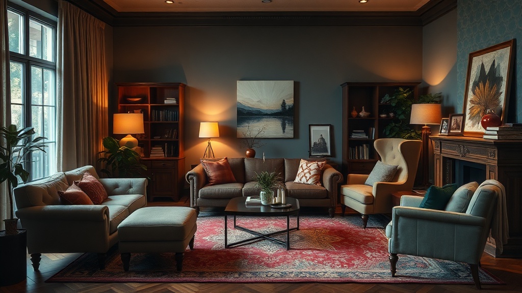
What Do I Do With a Fireplace That Isn't Centered?
Off-center fireplaces drive people nuts because they break the symmetrical room template we've all seen in magazines. But here's the thing—symmetry is a tool, not a rule. When your fireplace sits left of center or shares a wall with a window at an awkward distance, you have two options: fake the symmetry or embrace the asymmetry.
Faking symmetry works when the fireplace is slightly off-center. You'll balance visual weight rather than mirror-image placement. If the fireplace sits left, put a tall bookshelf on the right side of the wall to match its height and mass. The fireplace might be the focal point, but the bookshelf becomes its counterweight. Your seating arrangement still faces the fireplace, but now the wall behind it feels intentional rather than lopsided.
Embracing asymmetry is the bolder move—and often the better one. Angle your sofa to face both the fireplace and the room's true center. Add a chair on the opposite side that doesn't match the sofa's angle but relates to it. You're creating a conversational cluster that acknowledges the fireplace without letting it dictate everything. This approach feels collected over time rather than staged, which suits actual living better than showroom perfection.
For fireplaces on corner angles (those 1970s diagonal brick situations), resist the urge to push furniture into the corner to follow the fireplace lines. Instead, float your seating in a standard rectangular arrangement and treat the fireplace as architectural texture rather than the room's organizing principle. The fire still provides warmth and visual interest, but it doesn't force your furniture into contorted positions. A corner fireplace guide from Apartment Therapy offers more specific layouts for these tricky configurations.
How Do I Create Zones in an Open Floor Plan?
Open floor plans promise flexibility but often deliver vague, floating spaces that feel more institutional than homey. Without walls to define functions, you need other tools: rugs, lighting, and furniture orientation become your architecture.
The rug is your room's foundation—literally and visually. In an open plan, each zone needs its own rug that fits the furniture grouping, not just the space available. For a living area, all four legs of your sofa and chairs should sit on the rug. For a dining area, the rug should extend at least 24 inches beyond the table on all sides so chairs stay on it when pulled out. When these rugs overlap slightly or share a color family, the zones read as connected; when they're completely different, you signal separate functions.
Lighting reinforces these boundaries. A pendant over the dining table and a floor lamp arc over the reading chair do more than provide illumination—they create vertical definition where walls don't exist. Layer your lighting so each zone has its own controls. You want to be able to dim the living area while keeping the dining area bright, or vice versa. This flexibility transforms a static open space into one that adapts to different activities.
Furniture orientation is the subtlest tool and the most powerful. Pieces that face each other create intimate conversation zones. Pieces that all face the same direction—toward a view, a fireplace, or a television—create theater-style viewing areas. The back of a sofa can become a room divider, especially when paired with a console table that adds height and storage. Position that sofa with its back to the dining area and you've created two distinct spaces without a single wall. Bob Vila's guide to open floor plan layouts breaks down additional strategies for these spaces.
Don't forget the vertical plane. A tall bookshelf or folding screen can create psychological separation without blocking light. Plants work too—group three large specimens together and they become a soft green wall that defines space while keeping things airy. The goal isn't to recreate walls but to suggest boundaries that help people understand how to use the space.
The Three Measurements That Actually Matter
Forget square footage—it's nearly useless for furniture planning. These three measurements tell the real story:
Clearance: The space between pieces, not the pieces themselves. You need 14-18 inches between sofa and coffee table (close enough to reach your drink, far enough to walk between). Passageways need 30-36 inches as mentioned. Behind furniture that's against a wall, 3-4 inches is plenty—you're just allowing for baseboards and slight irregularities.
Sight lines: What you see when you enter and move through the space. The bottom of artwork should hang 57-60 inches from the floor—eye level for average-height viewers. TVs should have their centerline about 42 inches high for comfortable viewing from seated positions. These vertical sight lines matter as much as horizontal spacing.
Scale relationships: How pieces relate to each other and to the room. A massive sectional in a small room feels like it's eating the space. Tiny delicate furniture in a large room looks like dollhouse pieces. The rule of thumb: your largest piece should occupy about two-thirds of the wall it's on, leaving breathing room on both sides. If you're between sizes, go slightly smaller—negative space reads as intentional; crowding reads as a mistake.
Can Furniture Placement Really Fix a Bad Room?
Placement can't change a room's dimensions, but it can completely alter how you experience them. A room with low ceilings feels taller when you keep furniture low and vertical lines minimal. A dark room feels brighter when you angle seating toward windows and keep pieces from blocking natural light paths. A narrow room feels wider when you use horizontal elements—low credenzas, wide artwork, horizontal stripes—to counteract the vertical emphasis.
The biggest transformation comes from understanding that rooms are for doing, not just being. A living room isn't a container for furniture—it's a place for conversation, reading, watching, resting. When you arrange for activities rather than aesthetics, the layout often solves itself. The sofa faces the view because that's what you want to look at. The chairs angle toward each other because that's how people talk. The side table sits within arm's reach because that's where you need your coffee.
This activity-first approach also reveals what you don't need. That extra chair nobody sits in? It's blocking flow and adding visual weight without function. The oversized coffee table that forces everyone to stretch for their drinks? It's working against the room's purpose. Good arrangement is as much about editing as it is about placing.
For more on the psychology of spatial design, Architectural Digest's furniture arrangement principles explore how placement affects mood and behavior. The tools are simple—tape measures, graph paper, and a willingness to push furniture around until it clicks. The result is a room that finally works the way you actually live.