DIY Gallery Wall: Transform Blank Spaces Into Artful Displays

Why Gallery Walls Matter (And Why Most Fail)
This guide covers everything needed to design, plan, and install a gallery wall that looks intentional rather than accidental. The techniques here solve common problems: uneven spacing, mismatched frames, walls that feel cluttered instead of curated. Whether working with a blank living room wall or a narrow hallway, the math and methods below produce displays that hold visual weight without overwhelming a space. By the end, the skills to scale these principles to any wall dimension—from a 4-foot powder room nook to a 16-foot stairwell—will be clear.
The Foundation: Measuring and Mapping
Every successful gallery wall starts with arithmetic, not shopping. Before purchasing a single frame, measure the wall area to be filled. For a standard 8-foot ceiling room, a gallery wall typically occupies the middle 60% of the vertical space—roughly 36 to 60 inches from the floor. Horizontally, aim to fill 50% to 75% of the available wall width. A 12-foot living room wall calls for a gallery arrangement spanning 6 to 9 feet.
Mark the boundaries with painter's tape. This creates a visual container. Step back 8 to 10 feet—simulating the typical viewing distance—and assess. The taped rectangle should feel proportional to the furniture below it. Above a 72-inch sofa, a gallery wall measuring roughly 54 inches wide by 36 inches tall maintains proper scale. Too small, and the arrangement floats awkwardly; too large, and it overwhelms the seating.
Once boundaries are set, calculate the "white space" ratio. Professional installations typically leave 2 to 3 inches between frames. Multiply the number of frames by the spacing to determine how much wall area remains for actual artwork. A 12-piece arrangement with 2-inch gaps requires 22 inches of pure spacing. Subtract this from the total width to find the available real estate for frames.
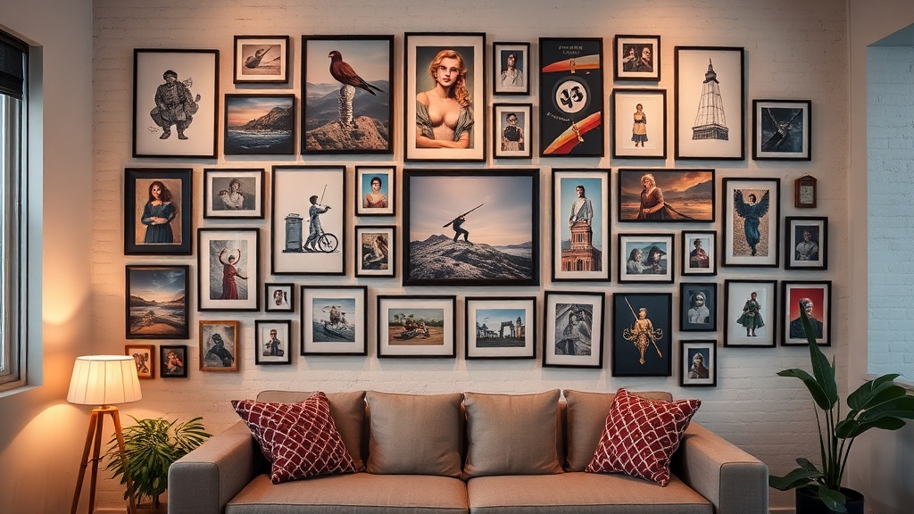
Frame Selection: The 70-20-10 Rule
Gallery walls fail when everything competes. The 70-20-10 rule—borrowed from architectural color theory—creates hierarchy. Seventy percent of the frames should share a unifying element: material (all wood), color (all black), or style (all thin profiles). Twenty percent introduce contrast: a single ornate vintage frame among simple modern ones, or one metallic accent among matte black. The final 10% provides surprise: a sculptural object, a small shelf, or an unframed canvas.
For a starter collection, the IKEA RIBBA frame series offers consistency at $9.99 to $24.99 per frame. The 16x20-inch size accommodates standard 11x14 prints with matting. Mix in two or three 8x10 frames and one 24x36 anchor piece. This combination—totaling roughly $120 to $150—fills a 6x4-foot wall section with professional coherence.
Thickness matters. Frames under ¾ inch deep read as flat and temporary. Frames exceeding 2 inches deep cast shadows that compete with the artwork. The sweet spot: 1 to 1½ inches of depth. When mixing frame depths, place thicker pieces toward the bottom of the arrangement. Visual weight sinks; honoring this prevents the composition from feeling top-heavy.
The Layout: Three Proven Configurations
The Grid
Grid layouts demand precision but reward with architectural impact. All frames must be identical in size and orientation. The spacing between frames must be uniform—2 inches is standard, 3 inches for larger pieces. Grids work best above furniture where symmetry grounds the room: dining room sideboards, credenzas, or headboards.
To execute: Find the center point of the wall section. Hang the center frame at 57 to 60 inches from the floor—standard gallery height for eye-level viewing. Work outward in concentric circles for odd-numbered grids, or in rows for even-numbered arrangements. Use a laser level. A ⅛-inch deviation between frames becomes glaring at 3-inch spacing.
The Organic Cluster
Organic arrangements accommodate mixed frame sizes and orientations. The key: establishing a baseline. Arrange frames so their bottom edges align along an invisible horizontal line 57 inches from the floor. This anchors the composition. Build upward and outward from this spine, keeping spacing between 2 and 4 inches.
Trace each frame onto kraft paper. Cut out the templates and tape them to the wall. Live with the arrangement for 24 hours. Move between rooms, catch glimpses from different angles. The templates reveal problems: a 5x7 frame that disappears from across the room, a vertical piece that breaks the horizontal rhythm. Adjust before driving a single nail.
The Linear Story
Linear arrangements suit hallways and stairwells. Frames follow the angle of the staircase or run horizontally along a corridor. For stairs: Measure 57 inches from the floor at the stair's midpoint. Maintain this height relationship as the frames ascend. The bottom of each frame should sit 8 to 10 inches above the stair rail—high enough to avoid collision, low enough to engage viewers climbing the steps.
Hardware: What Actually Works
Drywall anchors fail gallery walls. Period. The constant micro-movements of opening doors, HVAC cycling, and foot traffic vibrations work anchors loose within months. For anything exceeding 5 pounds, locate studs. A stud finder costs $15 to $40. The 16-inch-on-center spacing of standard framing accommodates most gallery layouts.
When studs don't align with the layout, use toggle bolts for heavy pieces (over 10 pounds) or French cleats for maximum security. A French cleat—a beveled wood strip screwed to both the wall and the frame—distributes weight across 12 to 18 inches of wall surface. For a 24x36-inch frame weighing 8 pounds, two D-ring hangers positioned 6 inches from the top corners provide balanced support.
Skip sawtooth hangers. They encourage single-point hanging, which tilts frames every time a door slams. D-rings with picture wire allow for micro-adjustments to level frames after installation. Use coated wire rated for double the frame's weight. A 10-pound frame gets wire rated for 20 pounds.
Artwork Selection: Building the Collection
Gallery walls thrive on constraint. Select a palette of three to four colors maximum, drawn from the room's existing textiles. If the sofa is charcoal and the rug contains rust and cream, the gallery palette might be black, terracotta, ivory, and sage. Every piece should contain at least two of these colors.
Mix media for depth: photography, line drawings, textural abstracts, pressed botanicals. The ratio depends on wall size. Under 6 feet wide: 60% photography or prints, 40% other media. Over 6 feet: equal distribution prevents visual monotony. Include one "breathing room" piece—a simple sketch or solid color block—that gives the eye rest.
Sources matter for budget control. Minted offers limited-edition prints from $25 to $60. Society6 provides larger statement pieces around $40 to $80. Framebridge custom-frames existing art starting at $65. For a 12-piece gallery wall, allocate $300 to $500 for artwork and $200 to $350 for framing. Thrift stores and estate sales supply vintage frames for $5 to $15 each—often solid wood with glass already included.
Installation Day: The Sequence
- Mark 57 inches from the floor at multiple points along the wall. Connect with a level line in pencil.
- Hang the center frame first—typically the largest piece, or the focal point. This establishes the composition's anchor.
- Work outward in pairs. Hang left, then right, then left again. This prevents the arrangement from drifting in one direction.
- Check level every two frames. Cumulative error compounds; catching it early saves patching later.
- Step back after every third frame. Photograph the progress. The camera reveals imbalances the eye accommodates.
For paper templates: leave them up during installation. Punch through the paper at hanger locations. Remove the template, mark the wall through the hole, then drill. The template prevents the "hold and hope" method that produces crooked arrangements.
Common Mistakes and Fixes
Problem: The gallery wall looks cluttered.
Diagnosis: Frames are too small for the wall, requiring too many pieces to fill space.
Fix: Remove 30% of the frames. Replace with 2 to 3 larger pieces. Negative space is not empty space—it is intentional breathing room.
Problem: Frames won't stay level.
Diagnosis: Single-point hanging or inadequate hardware.
Fix: Install D-rings and picture wire. Apply small rubber bumpers to the bottom corners of frames. These create friction against the wall without visible supports.
Problem: The arrangement feels chaotic.
Diagnosis: No unifying element—every frame is a different color, material, and style.
Fix: Spray paint frames to unify. Matte black, warm white, or natural oak spray paint ($6 per can) transforms mismatched thrift finds into a coherent collection.
Advanced Techniques: Layering and Evolution
Gallery walls need not be static. Ledges—narrow shelves installed at 57 inches from the floor—allow for rotation. A 6-foot picture ledge ($30 to $60) accommodates 8 to 10 leaned frames. Swap pieces seasonally without patching walls. This approach suits renters or the indecisive.
For permanent installations, plan for evolution. Leave 6 to 12 inches of expansion space at the arrangement's edges. As the collection grows, the composition can absorb new pieces without total reconfiguration. Document the layout with measurements. When adding a frame three years later, the original spacing data eliminates guesswork.
The Payoff
A well-executed gallery wall transforms a room's energy. It draws the eye upward, emphasizing ceiling height. It personalizes generic spaces with evidence of taste and travel. Most importantly, it demonstrates competence—the quiet confidence of someone who measures twice, understands structural loads, and respects the mathematics of good design.
The tools required are minimal: a level, a stud finder, a tape measure, a pencil, and patience. The investment—roughly $500 to $800 for a substantial collection—returns daily visual satisfaction. Start with the measurements, select with constraint, and install with precision. The wall awaits.