9 Furniture Layout Mistakes That Make Your Room Look Cheap (And the Design Math to Fix Them)

Your Furniture Is Floating Like It’s Afraid of Commitment
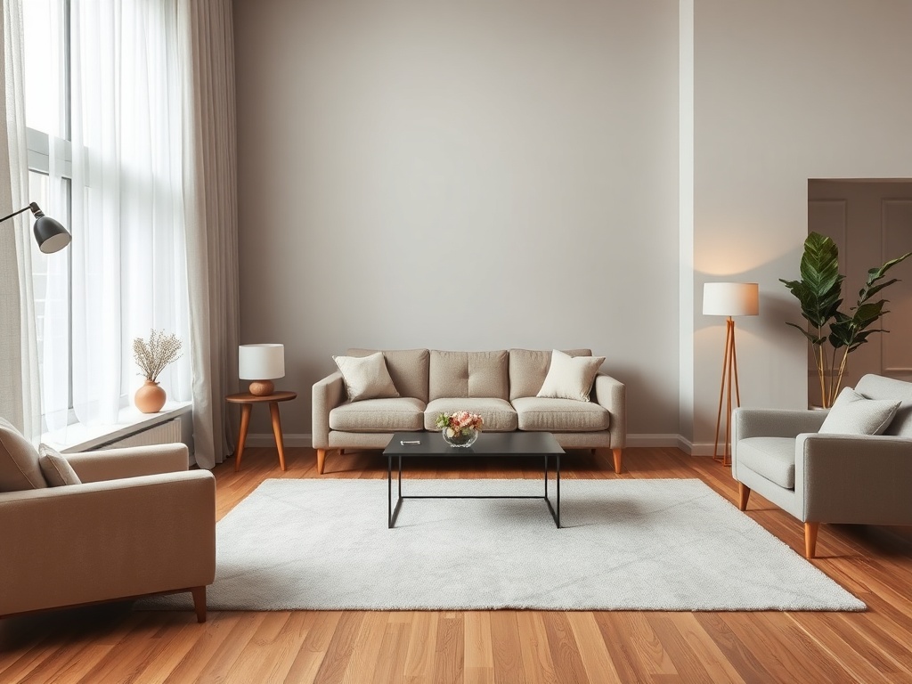
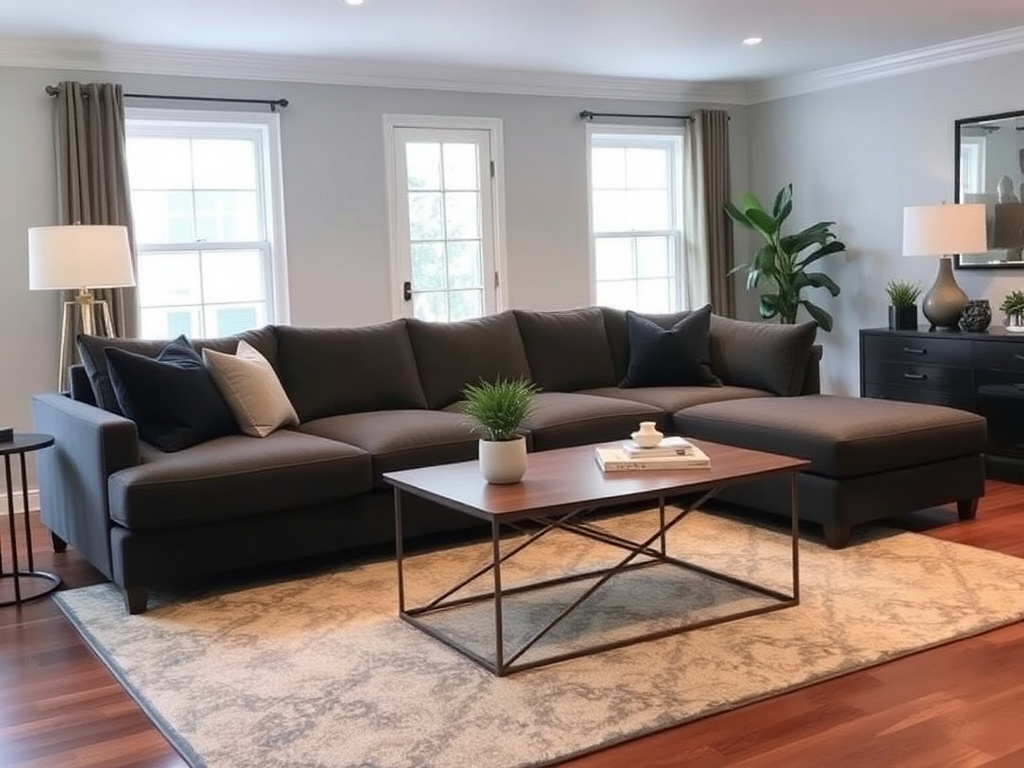
The Rug Is Too Small (This Is the #1 Offender)
Everything Is the Same Height (Flatline Design)
Your Coffee Table Is the Wrong Size
You Ignored Negative Space (Yes, Empty Space Matters)
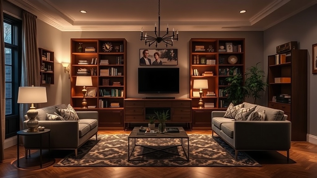
Your TV Is Mounted Like a Billboard
You Didn’t Define Zones (Especially in Open Layouts)
Lighting Is an Afterthought (Overhead Only = Interrogation Room)
Your Scale Is Completely Off
Listen, nothing in your apartment is "cheap" because you don’t have money—it looks cheap because the layout is lying. Bad spacing, wrong scale, and zero respect for visual weight will make even solid wood pieces look like flat-pack regret.
I’ve walked into rooms with $3,000 sofas that felt like waiting rooms and $80 Marketplace rescues that looked like editorial spreads. The difference is never the price tag. It’s the Design Math.
We’re going to fix that. No fluff, no "just add a plant." We’re talking ratios, spacing, and how your eye actually reads a room.
Let’s get into it.
1. Your Furniture Is Floating Like It’s Afraid of Commitment
If every piece in your room is pushed against a wall or randomly drifting, your layout has no anchor. It reads like you gave up halfway through moving in.
The Design Math
A room needs a central axis—usually your largest piece (sofa, bed, or table). Everything else should relate to it with intentional spacing, not panic distance.
Fix: Pull your seating 6–12 inches off the wall and build a conversation zone. Your rug should connect the pieces, not sit alone like a sad island.
2. The Rug Is Too Small (This Is the #1 Offender)
If your rug only fits under the coffee table, congratulations—you’ve visually shrunk your entire room.
The Design Math
A rug should anchor at least the front legs of all major seating pieces. Ideally, all legs sit on it.
Fix: Size up. Yes, it costs more. No, there’s no workaround. A properly scaled rug increases perceived room size by ~20% (not scientifically measured, but your eyes know it’s true).
3. Everything Is the Same Height (Flatline Design)
If your room reads like a flat horizon line, you’ve created visual boredom.
The Design Math
You need vertical variation: low (coffee table), mid (sofa), high (lamp or shelving). Think in thirds.
Fix: Add a tall floor lamp or vertical shelving unit. Break the line. Your eye should move, not stall.
4. Your Coffee Table Is the Wrong Size
Too big? You’re navigating an obstacle course. Too small? It looks like an afterthought.
The Design Math
Coffee table length = roughly 2/3 the length of your sofa.
Fix: Measure your sofa. Do the math. Stop guessing.
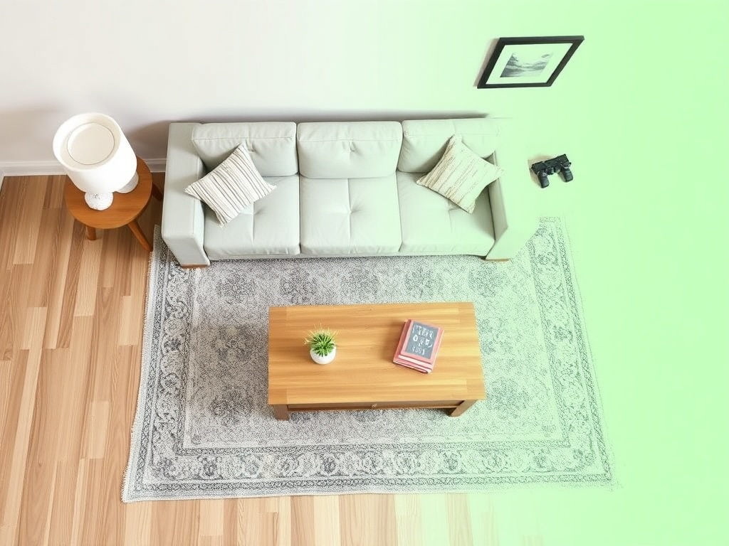
5. You Ignored Negative Space (Yes, Empty Space Matters)
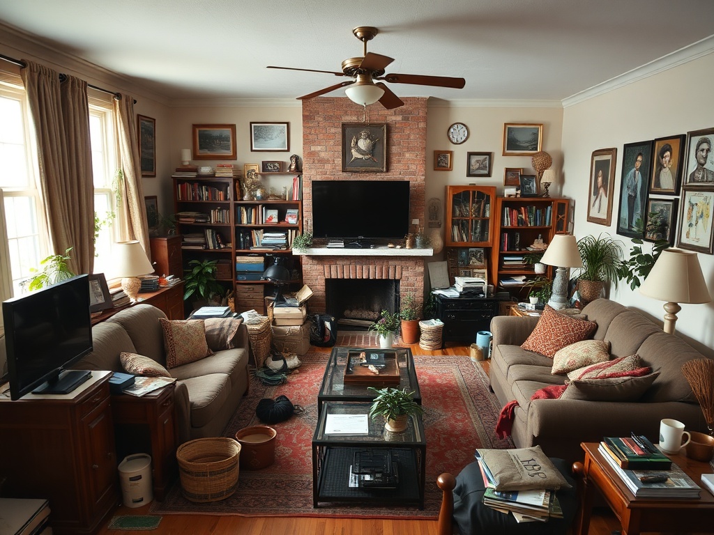
Not every inch needs furniture. Overfilling a room is the fastest way to make it feel cheap and chaotic.
The Design Math
Leave 30–40% of your floor area visually open. That’s your breathing room.
Fix: Remove one piece. Just one. (I know—it hurts.) The room will immediately feel more intentional.
6. Your TV Is Mounted Like a Billboard
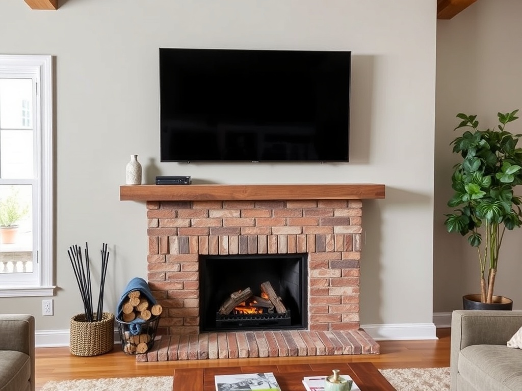
If your TV is closer to the ceiling than your eye line, your neck already hates you.
The Design Math
Center of screen should be at seated eye level—roughly 40–42 inches from the floor.
Fix: Lower it. Ignore the fireplace if you have to. Function wins.
7. You Didn’t Define Zones (Especially in Open Layouts)
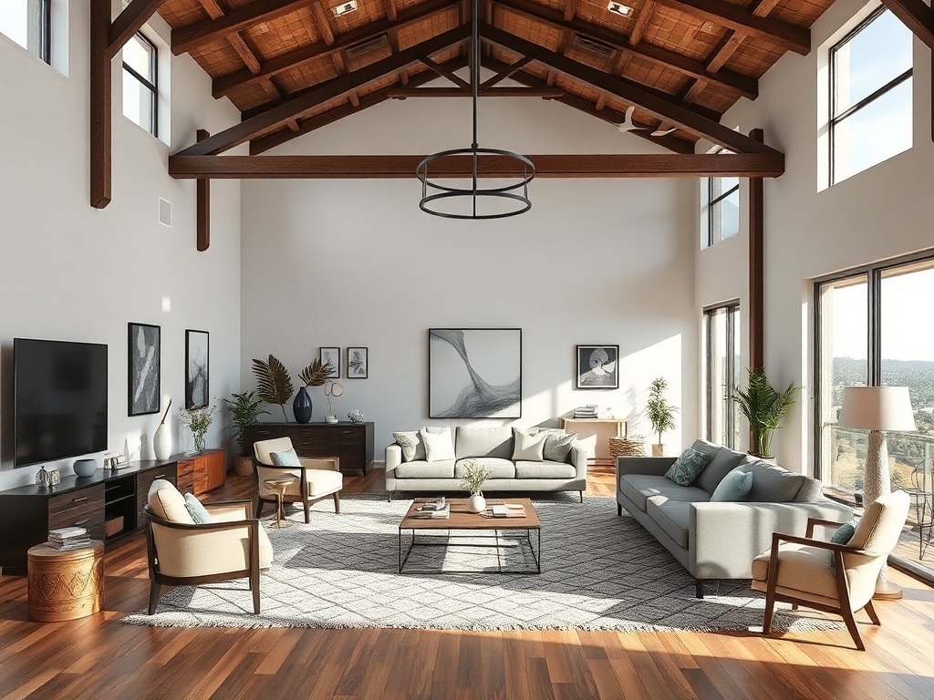
If your living room, dining area, and workspace are blending into one confusing blob, that’s not "open concept." That’s chaos.
The Design Math
Each zone needs a visual boundary: rug, lighting, or orientation shift.
Fix: Use rugs or rotate furniture 90 degrees to define separate functions.
8. Lighting Is an Afterthought (Overhead Only = Interrogation Room)
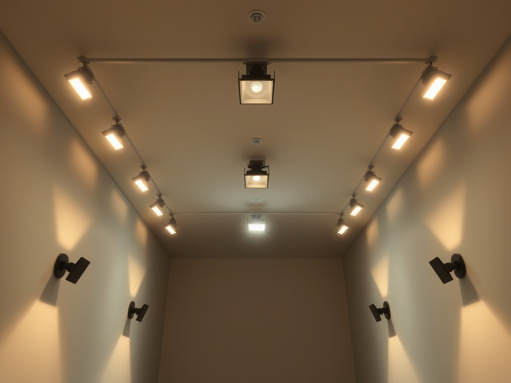
If your only light source is overhead, you’ve built an interrogation room.
The Design Math
Use three light sources per room: ambient, task, and accent.
Fix: Add a floor lamp and a table lamp. Instantly better depth.
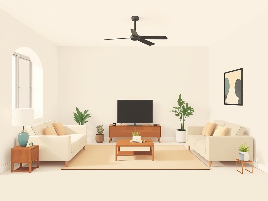
9. Your Scale Is Completely Off
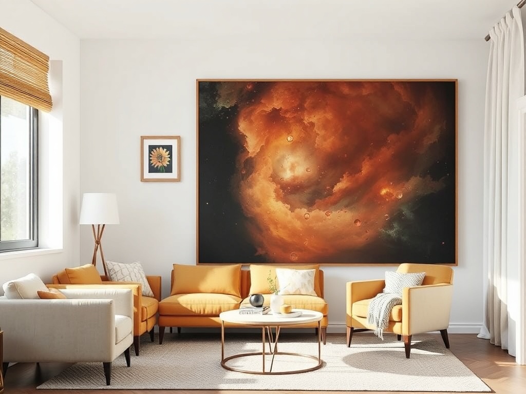
This is the silent killer. A tiny piece of art on a massive wall makes everything feel temporary and unfinished.
The Design Math
Art above furniture should be 2/3 to 3/4 the width of the piece below it.
Fix: Go bigger or group pieces. Stop undersizing.
The Reality Check
You don’t need new furniture. You need better decisions.
I’ve rearranged rooms using nothing but a tape measure and stubbornness (and yes, one mild breakdown when nothing aligned). The difference between "cheap" and "intentional" is usually about 3 inches and one correct ratio.
Respect the spacing. Respect the scale. Your room will stop looking like a placeholder and start looking like you actually live there on purpose.
Now go move your rug. Seriously.